HealthPartners is unique in that it is an integrated health care organization providing health care services and health plan financing and administration. It's the largest consumer governed nonprofit health care organization in the nation - serving more than 1.5 million medical and dental health plan members nationwide. The care system includes a multi-specialty group practice of more than 1,700 physicians.

HealthPartners is driving change that helps members live healthier lives and lower costs. Through unique wellness programs, advocacy efforts and innovative payment approaches which incent and reward quality, HealthPartners is able to provide better value for our customers. By partnering with providers, members, purchasers, and the community, HealthPartners is leveraging plan capabilities to develop initiatives which improve health, member experience and affordability.
HealthPartners is transforming the delivery of health care and has aligned its mission with the Triple Aim: improving the health of the population, enhancing the patient’s experience, and making health care affordable.
The Triple Aim simultaneously accomplishes these three critical objectives:
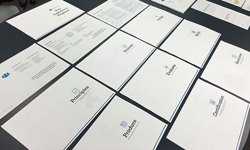
In late 2014 HealthPartners began undergoing a rebrand as they had recently merged with Park Nicollet, another large health care company in the Twin Cities that is focused on care delivery. This merger and the launch of the Affordable Care Act quickly moved both companies into a more extreme competitive market. I was hired at the turn of 2015 in order to help spearhead and transform the organization into a more user-centered focus.
In order to know where to begin, I had to have an understanding of where the organization was from a UX maturity standpoint. This concept of UX maturity was introduced to me by Jared Spool of UIE. The following table describes the various levels to measure the organization by.
| UX Maturity Scale | Description |
|---|---|
| Dark Ages: No UX Design | No resources for design. All resources go to business and technological needs. |
| Spot UX Design | Occasional UX projects with limited success. |
| UX Design as a Service | UX team serves projects on an as-needed basis. |
| Embedded UX Design | Project teams get their own UX resources. |
| Infused UX Design | Every project team member has fluent design skills. |
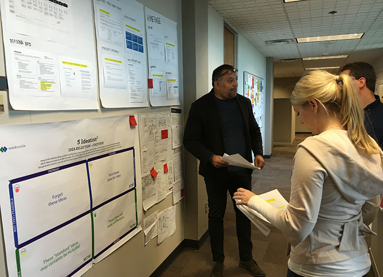
Using the above chart and examining the different agile teams, HealthPartners fell into a couple of stages depending on the project. Overall though, the dominant stage was Embedded UX Design. Most of the important projects that were led by IT had a dedicated UX designer. However, having a dedicated UX designer didn't necessarily mean that the right process was being considered. It simply meant there was someone to do the user interface work.
In order to begin transforming the culture of how the business and teams worked with the dedicated UX designer, I had to define what user experience is and is not. This definition would establish common ground on which we could find alignment. This was crucial since to the organization, UX design simply meant visual design and layout.
The perceptions and responses someone has when they interact with HealthPartners products and services.
Like any good coach, you have a series of plays to reach your goal. Depending on the rules of the game, identifying the defense, and the shifting landscape you must adapt your strategy and know what plays to call.
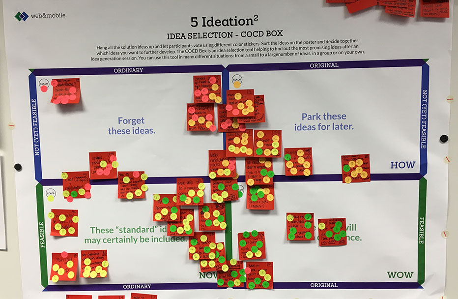
UX strategy plays range from providing regular usability testing, to introducing design studio workshops, to shifting the roadmap from a feature focus to a customer-problem focus. Each play helps the UX team, the product and service teams working with the UX team, and the rest of the organization move towards delivering better designed user experiences.
The process in the plays are inherently iterative, both within each phase and throughout the definition, design and development of the product or service. It also relies on a continual process of learning more about customer needs and wants as we work towards user experience deliverables.
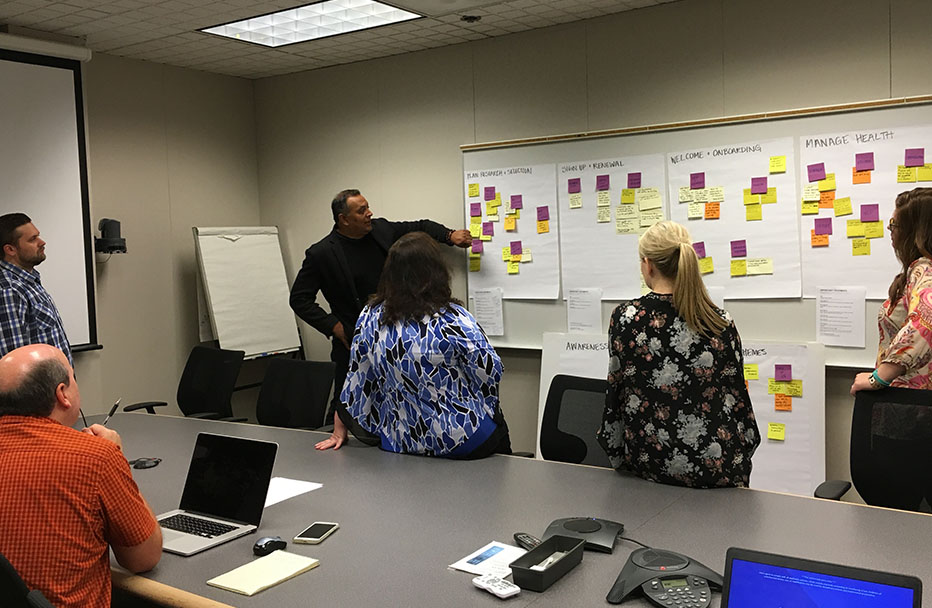
The UX plays rely on the collaboration of a cross-functional team throughout all stages. Great user experiences are powered by customer and user-centric thinking in all aspects of design development.
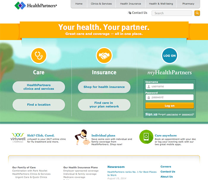
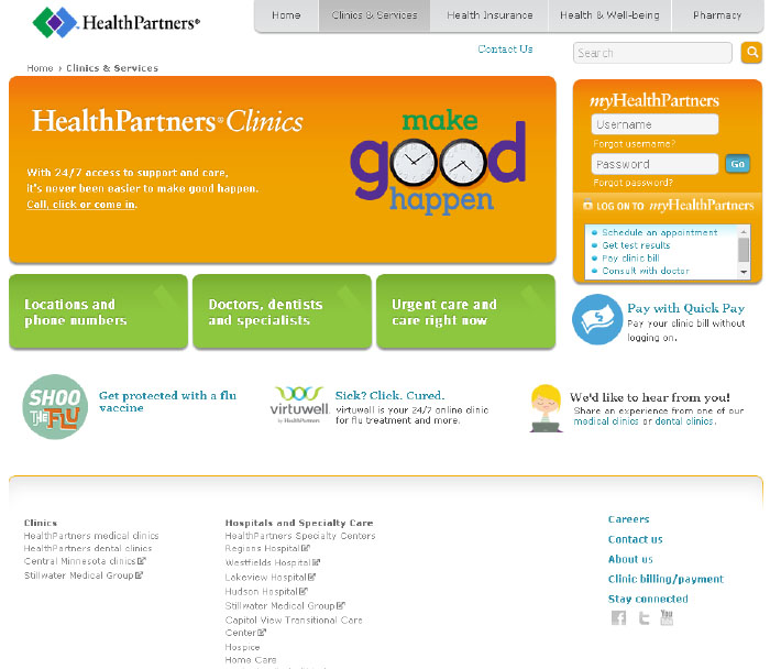
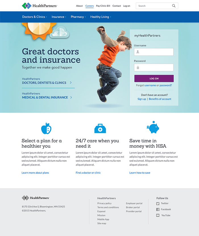
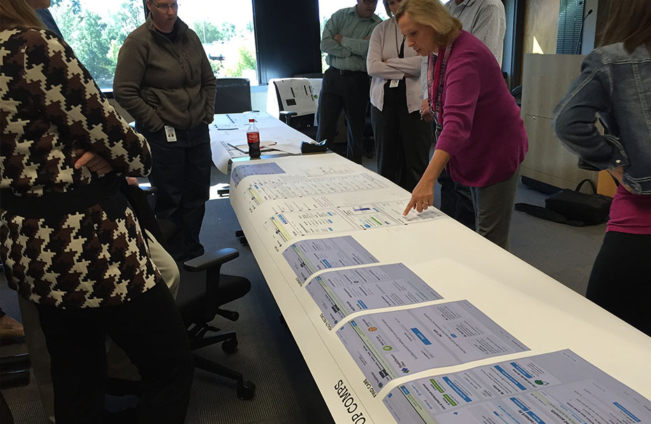
The public website for HealthPartners was the first project to reflect the new brand attributes. With this work, there were many opportunities for the organization and for the web and mobile agile teams.
The organization benefited by using this redesign effort to establish a content strategy for the public facing content of each business line. Many activities and co-creation meetings took place resulting in a more intuiative taxonomy and site map. When it came to establishing page templates, the team was able to introduce a more focused and effective approach to promotional space on the website. This enabled the marketing team to better plan for their campaigns and provided our users with a more consistant and less disruptive messaging.
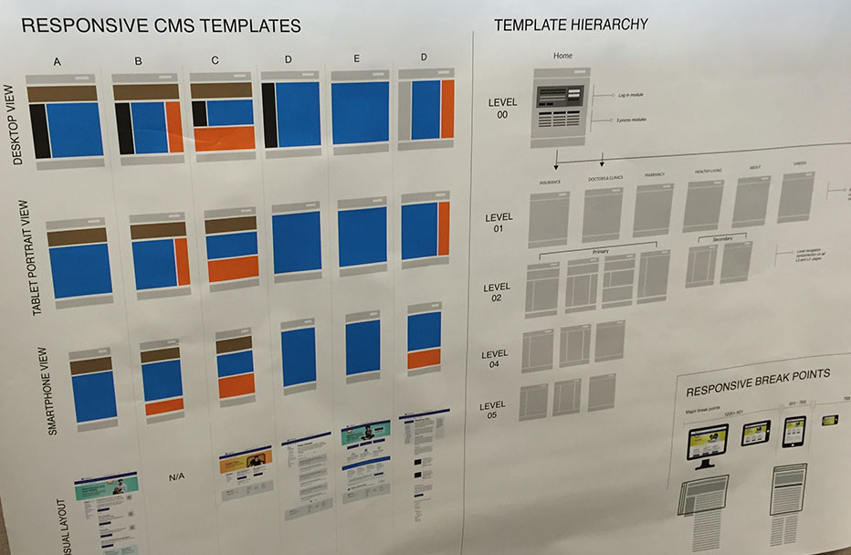
The UX team took the opportunity to establish a style guide and to utilize the Atomic Design methodology. This would ensure a more efficient workflow in the future and the ability to have consistency across our digital portfolio. The goal was to change the role of the UX designer, we needed a workflow and system to support getting us out of the day-to-day build and more into the upfront research and strategy.

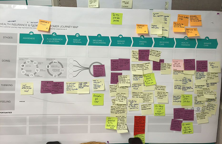
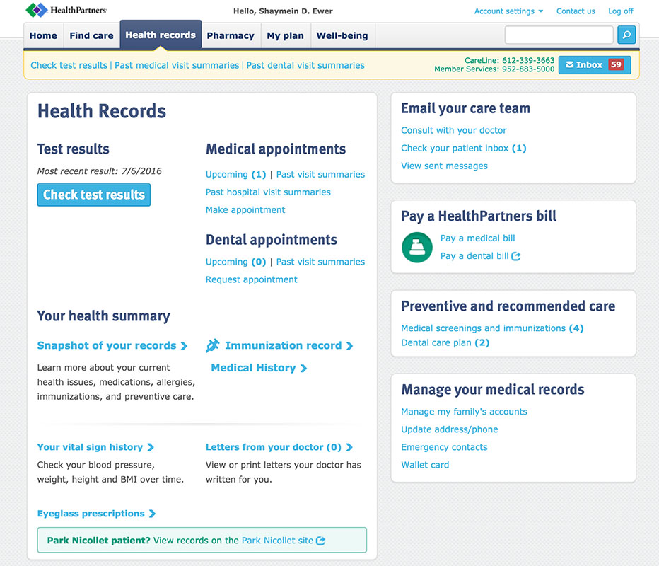
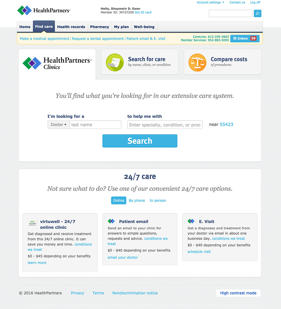
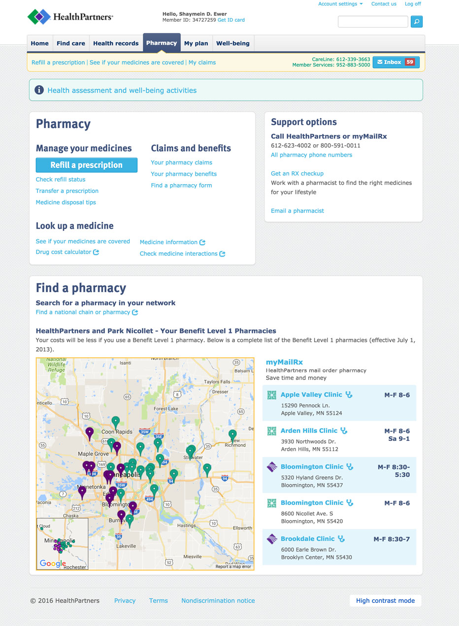
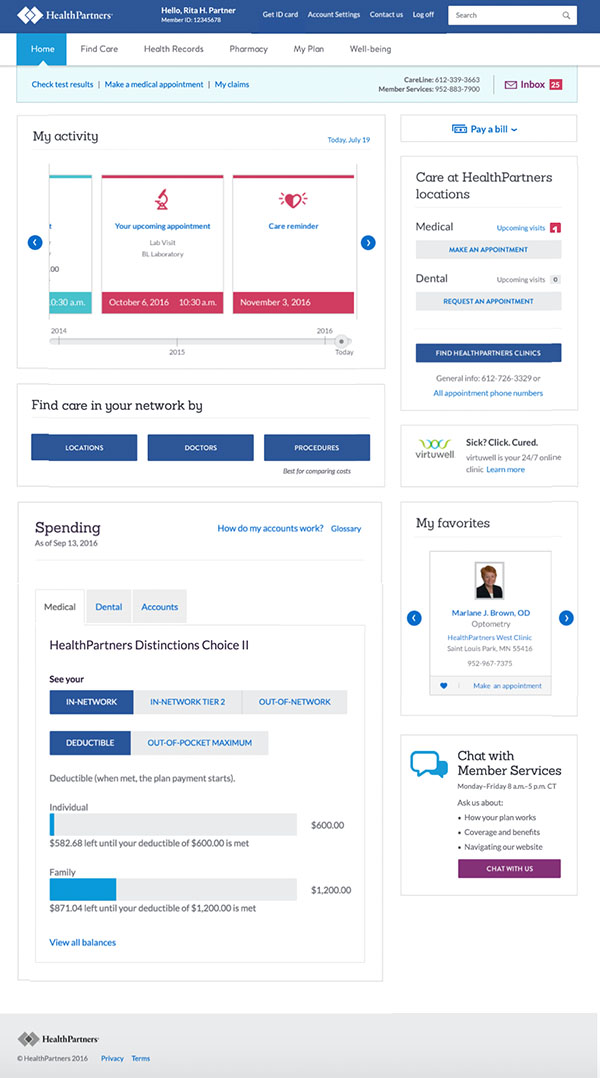
The authenticated website for HealthPartners was the next project to reflect the new brand attributes as well as the transformation to mobile. This complex system is made up of over 20 individual applications and features over 100 quick link components. These applications are dynamically loaded based upon many different variables of your plan and care type as well as if you are individually insured or through an employer.
HealthPartners is in an industry with increasing amounts of data. As we approached the redesign and build of the many complex systems we sought to understand the meaning out of information. The challenge for the business, engineers, and UX team alike was to inventory and audit the system and then design a set of interfaces that convey complex information with simplicity, that maximize user interactions, and scale to future technologies that will interact with users as robustly as users interact with them.
Prioritize and improve content based on consumer needs.
Make it easier for consumers to find information and complete tasks.
Empower our customers to easily manage their family’s health and budget.
Ensure easy access and use of digital information and tools for all users


I have two decades of experience leading and coaching interactive and design teams to work smarter, better, and more collaboratively. I am currently the Lead User Experience Designer for Honeywell's Aerospace Commercial Drone team in Golden Valley, MN.